0 1 - I N T R O
Role insights - Helping 50,000+ jobseekers navigate career transitions with machine learning
02 - Quick Stats
50,000+
17%
of users click through to job descriptions. A key revenue driver for the business
$300,000+
Secured revenue from 3 enterprise clients citing career content as a decision factor in their decision to use the Madgex Platform.
72%
of surveyed users discovered roles they hadn't considered before.
03 - The Problem
A transaction relationship that needed to be recurring
Guardian Jobs was losing users to LinkedIn and Glassdoor. People visited, applied for one or two jobs, then disappeared. The brief: create content that brings users back between job hunts, as a white-label solution across 16+ client boards.
The user problem was more interesting. Career progression was invisible. 9/12 early-career professionals asked in our interview round, couldn't accurately name roles one level above theirs. Their issue was a discovery problem not a search problem.
The end-product had three parts:
Role Explorer
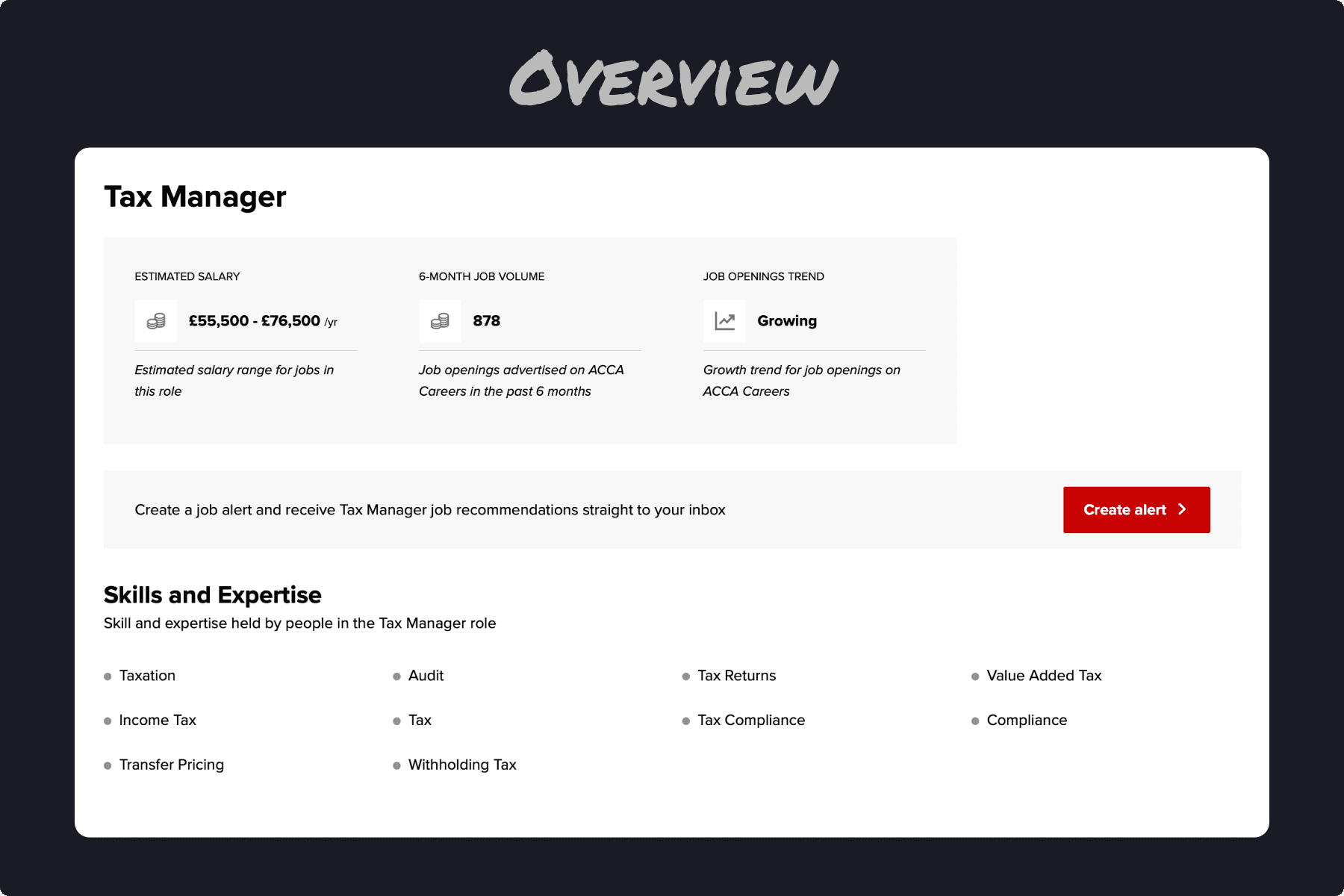
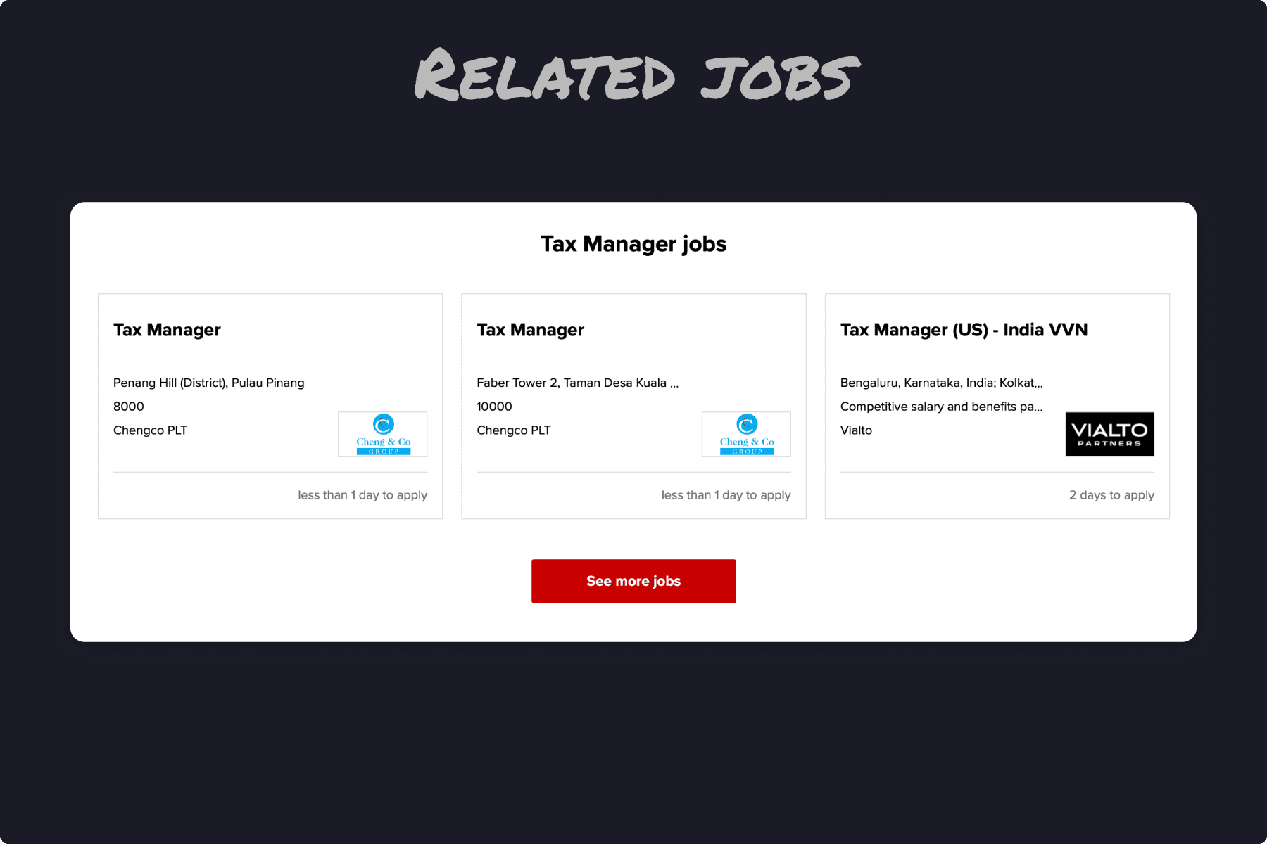
A Lister page for jobseekers to browse and discover 200+ professional roles by industry and career stage.
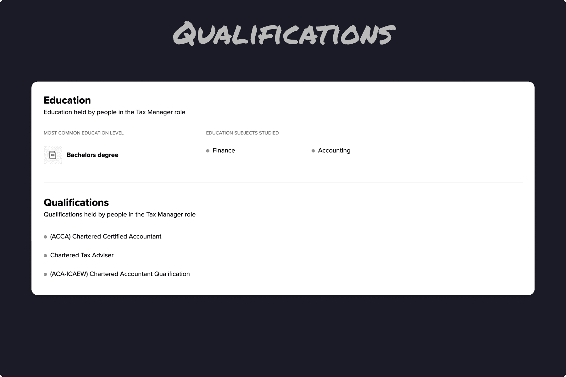
Role profiles
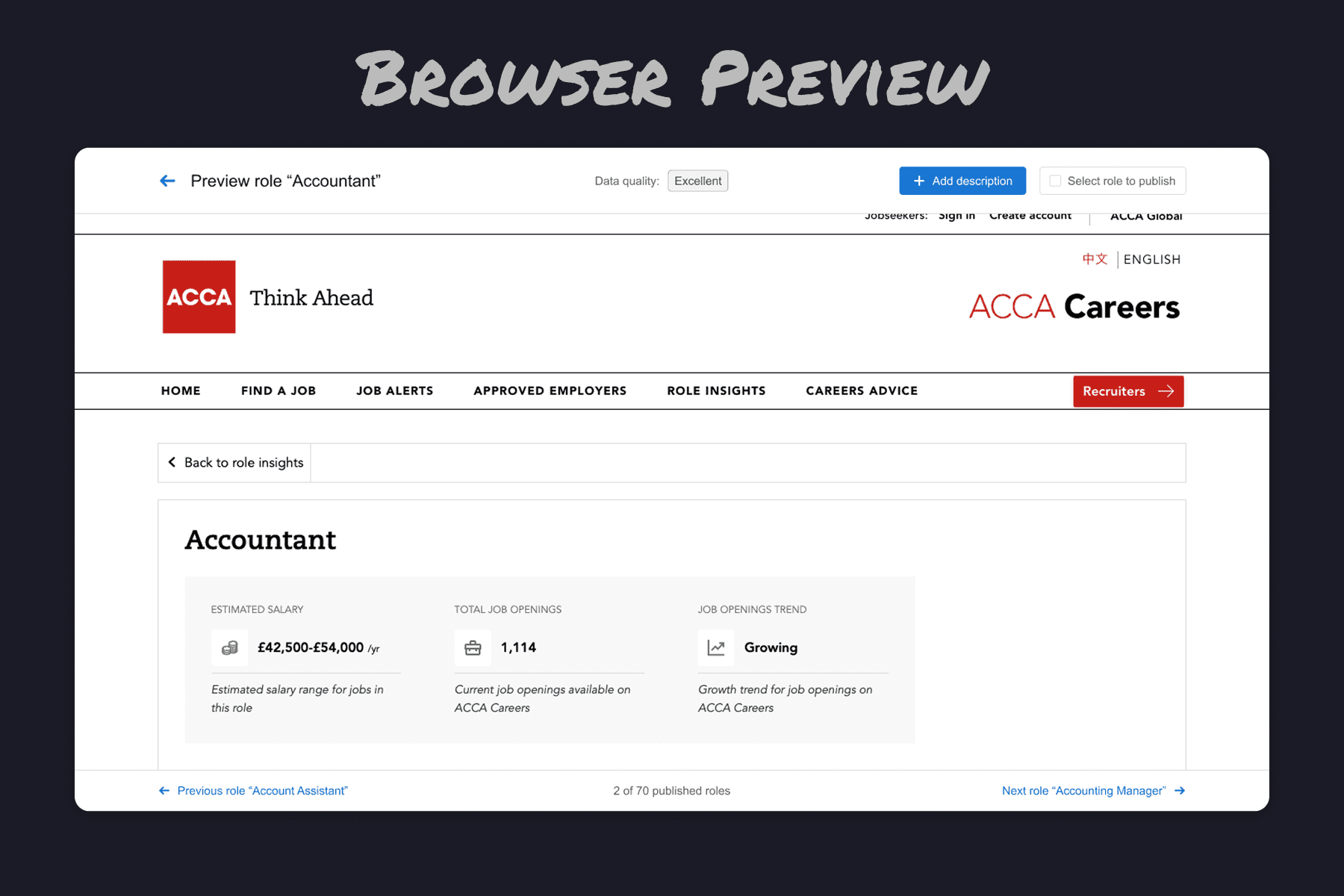
Individual pages a decade of gathered CV data: career paths, qualifications, salary, and hiring trends.
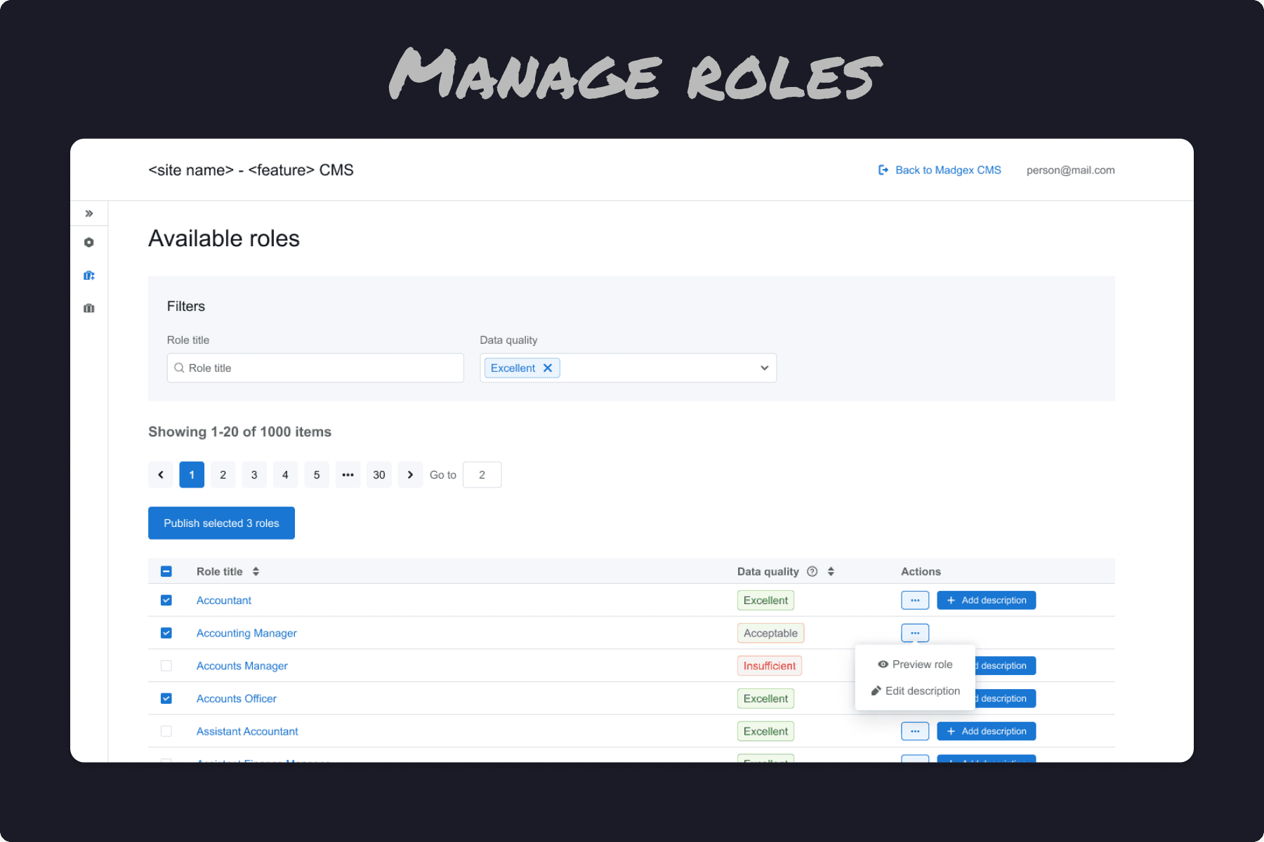
Management dashboard
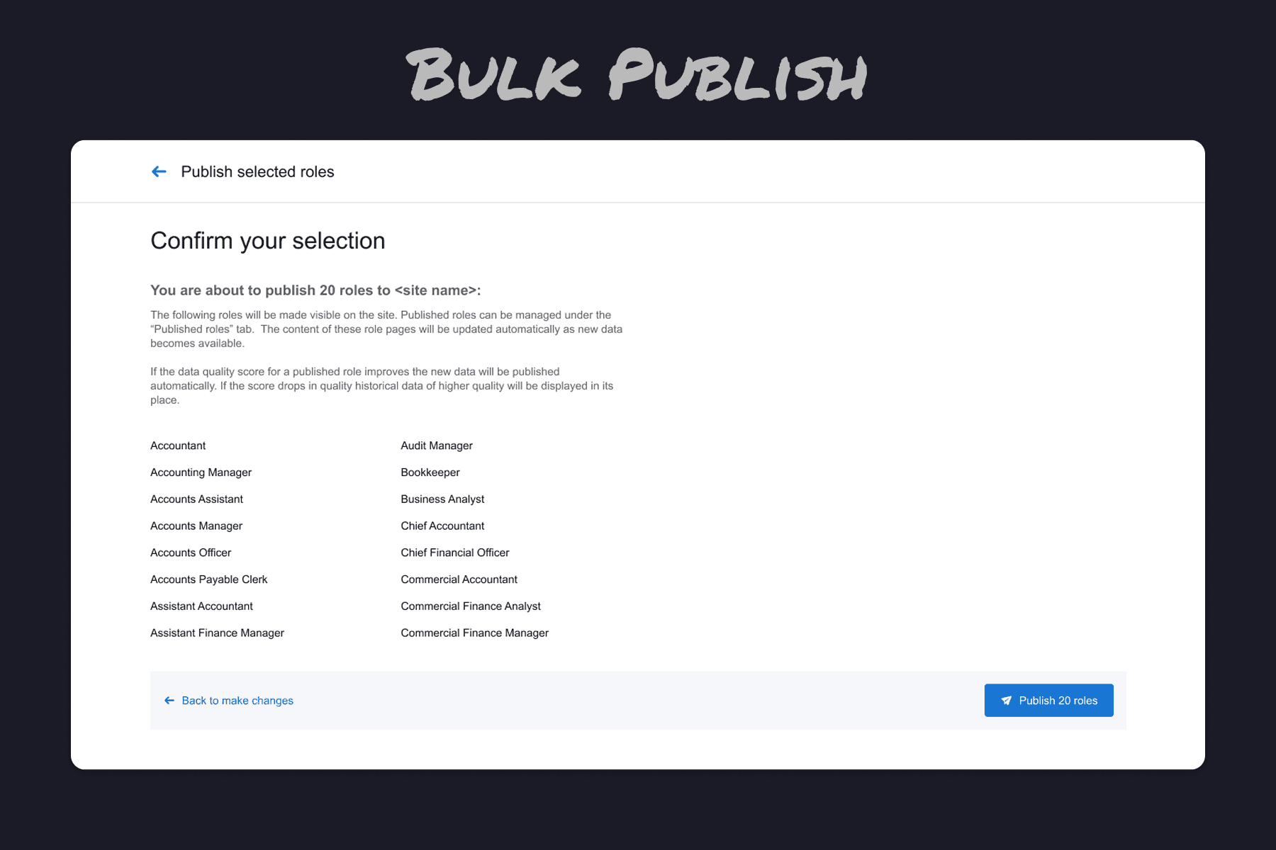
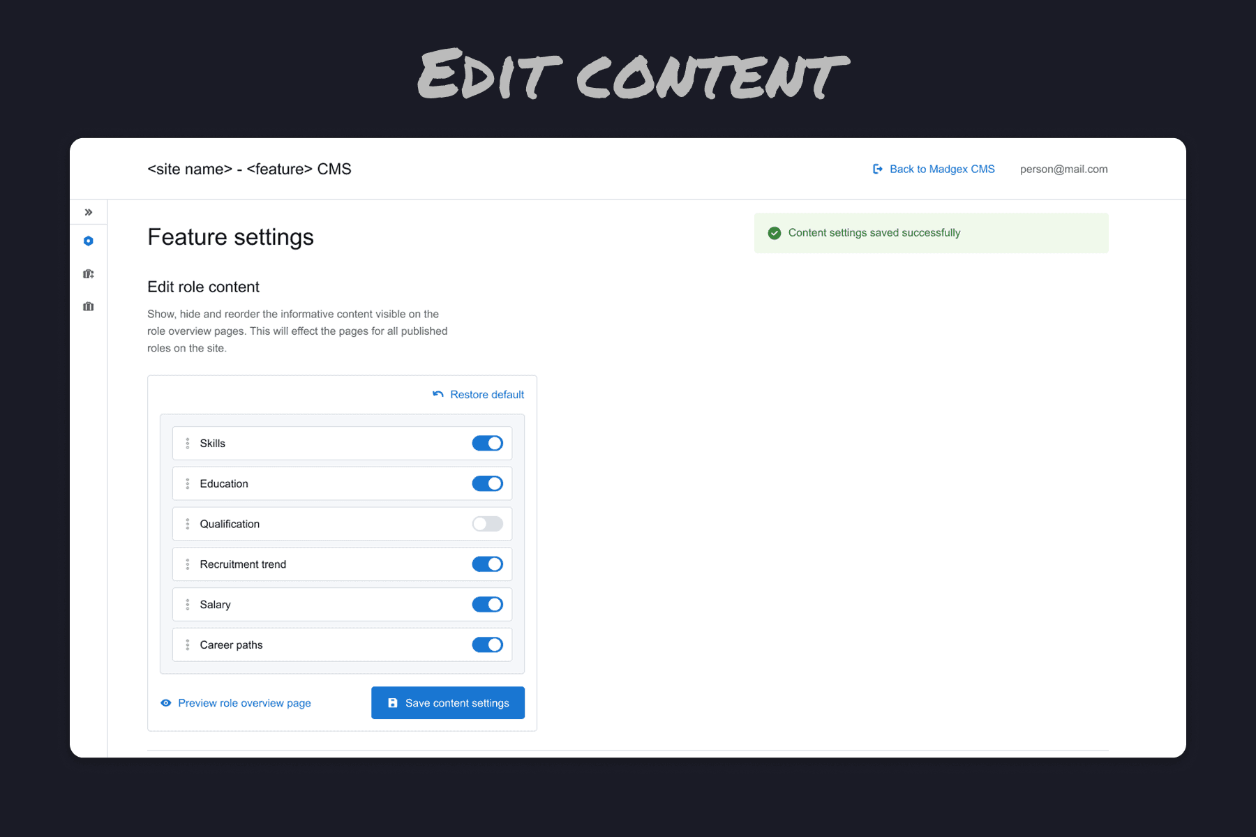
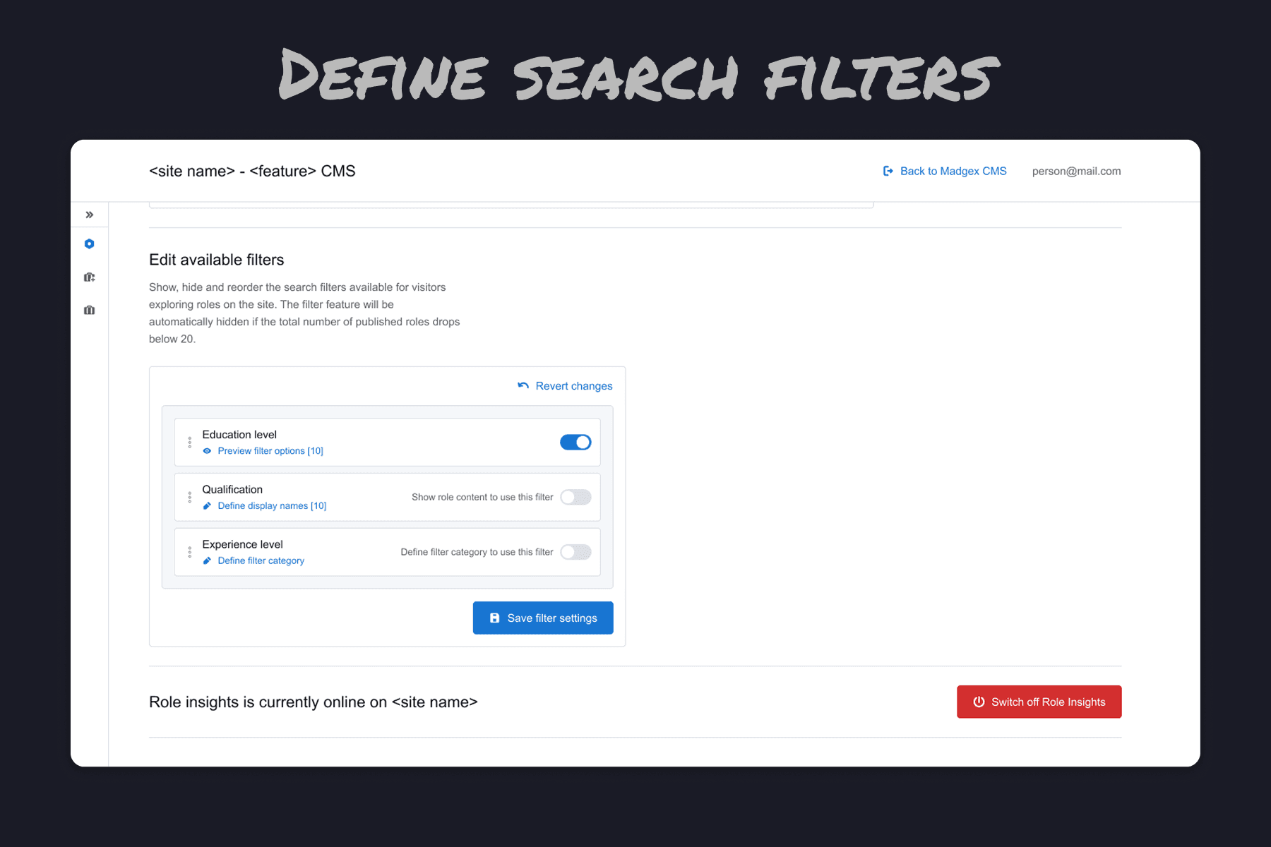
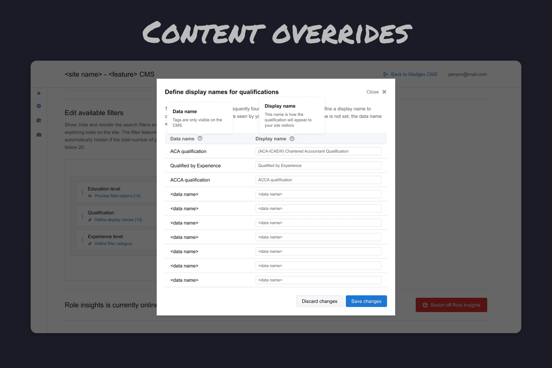
CMS for site owners to assess data quality scores and publish role profiles to their boards.

04 — Research Insights
What 12 interviews and diary studies revealed
I synthesised our jobseeker research data into design implications. To translate findings into actionable direction, I used the jobs-to-be-done framework and developed the JTBD hierarchy map. This was a new process for grouping related jobs into themes and linking derivative needs back to the core user need for the product. This became a playbook entry for our team, used across subsequent projects.

JTBD hierarchy map
Insight 1
Career paths are invisible
9 of 12 participants couldn't name roles one level above their current position. Job boards only show what you search for, creating a discovery gap.
Insight 2
Trust requires transparency
Users trusted data-driven insights over company-written content. "Based on X CVs" surfaced repeatedly as a trust signal.
Insight 3
Learning mode vs. applying mode
Pushing users toward listings during exploration broke their flow. Role insights needed to work as standalone educational content.
Insight 4
Data credibility concerns
Without context about sample size, unexpected career progressions looked unreliable. Transparency needed to be simple, not statistical.
05 — Critical decisions
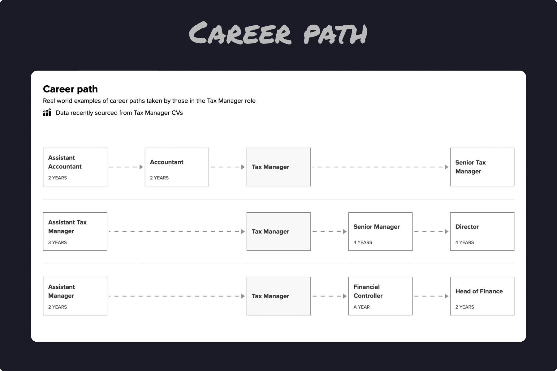
Career paths first, against my initial instinct
I structured the role pages with qualifications and skills at the top, assuming these were the most important to our users. User testing proved me wrong, 5 of 6 users scrolled straight past qualifications looking for the Career paths section, asking "Where can this role take me?"
The issue was, career paths were our most experimental section. The data confidence was the least consistent across our clients' job boards, but it matched what users actually wanted.
So we added a feature in the CMS for clients to rearrange sections or switch them off if they felt confidence wasnt sufficient. We defaulted the Career paths section to the top to reflect our users' priorities.

Career path focus

Final designs
Data transparency vs. visual simplicity
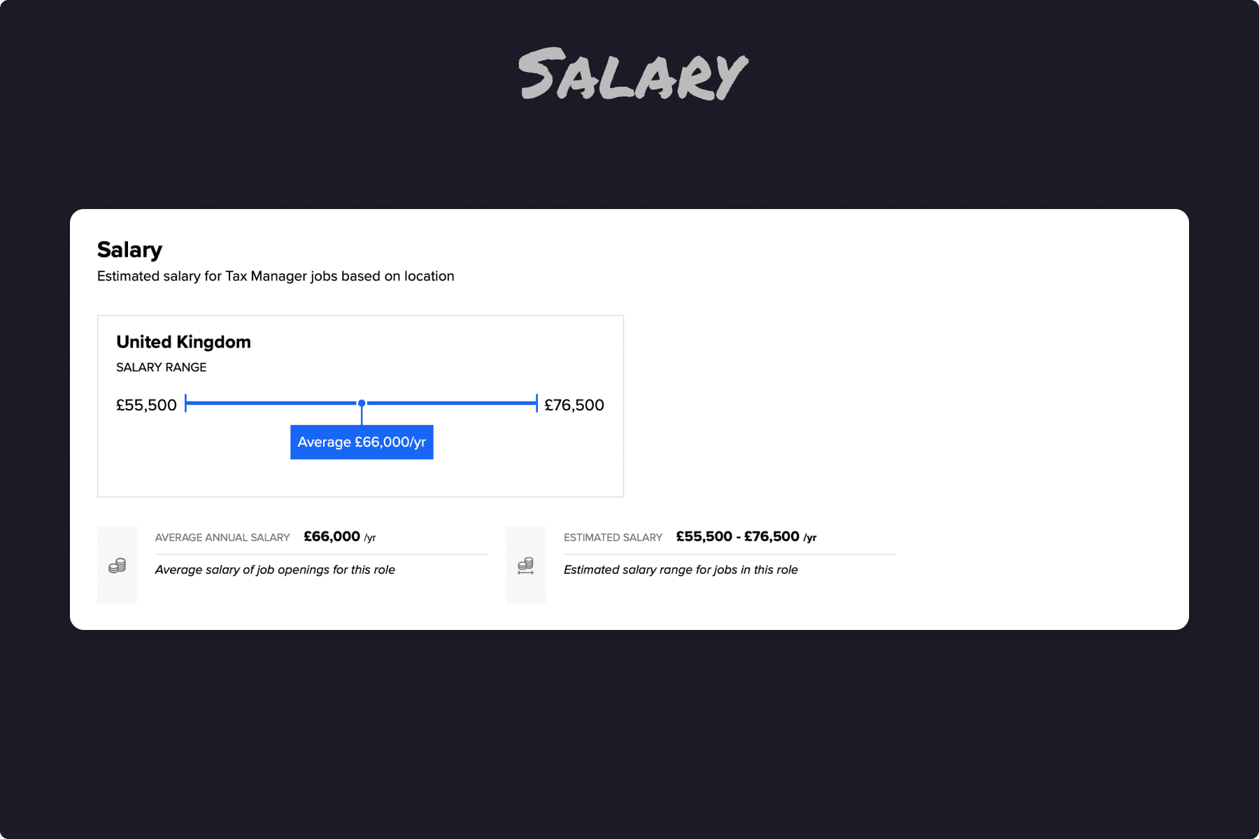
Our Data Scientists wanted confidence intervals on every data point. I feared this level of detail would be overwhelming to our typical user. Instead I advocated for selective transparency.
"Based on 1,200 registered nurse CVs" did more for credibility than statistical rigor. Post-launch: 85% agreed they found the data credible or very credible.
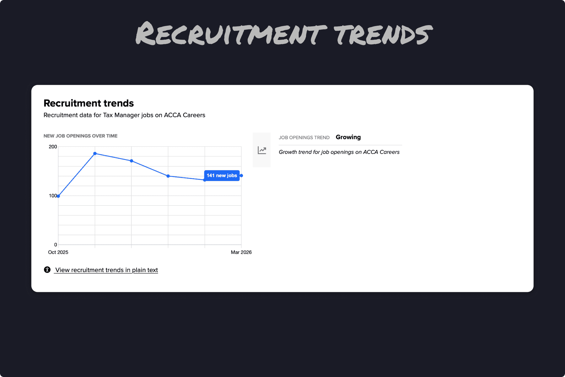
Designing data visualisations with the data team
I ran a collaborative workshop with the data scientists using rapid visualisation exercises to explore potential components.
The design direction: selective data points not crowded graphs, brand colour highlights to guide attention, hover interactions for deeper investigation.
The goal: convey the key insight requiring minimal cognitive effort.


A key trade-off
I knew we had one shot at a strong first impression with our users. A whiff of unreliable data would put them off the product forever.
So we launched 120 high-quality profiles instead of 200 patchy ones. Better to ship deep, trustworthy profiles than broad but incomplete coverage. Roles below threshold asked users to "Check back soon" with an option for email alerts.
06 — Design Approach
Principles that scaled across the product
White-label design system
Built around 8 brand tokens. Layout and typography fixed, colour palette variable. All 12 clients launched in 6 months with no custom design per client.
Encourage exploration
Highly scannable content. Help users recognise scale and depth of data available. Iterative testing to get users finding key info from 45+ seconds to 12 seconds.
Data handled honestly
Tools that let clients publish content, and jobseekers plan their career, with upmost confidence.
Phased rollout process
Phase 1: profiles via matching job descriptions. Phase 2: Role Explorer for standalone navigation. Phase 3: Personalisation and role matching (paused due to data maturity). I documented this as a template. The MVP release sitemap, became a company playbook entry.
UX approach to writing
Structured writing across the product. Informative descriptions, error messaging that never blames the user, always offers an action. Connected to a practice I presented at UX Camp Brighton.

Brand tokens

Lister redesign

Phased rollout

UX writing
07 - The Outcome
50,000+
Monthly users across our client sites
$300,000+
Secured revenue from 3 enterprise clients citing career content as a decision factor in their decision to use the Madgex Platform.
3.4
Role profile views per session (Target 2+) showing users gaining a wider understanding of roles available
17%
Click through to job descriptions. A key revenue driver for the business
72%
of surveyed users discovered roles they hadn't considered before.
16+
Client sites launched with suitable data confidence for the product
“The most valuable feature for me is career paths, it is not something you would see much of - it is extremely useful.”
"I really like the qualification suggestions, knowing what I need to reach the job I'm aiming for is so helpful"
Role insights gallery
CMS gallery
08 — On Reflection
What I learned
Trust your users over your assumptions.
Stated preference didn't match revealed preference. Now I validate priorities with behaviour data, not just interview responses.
MVP doesn't mean minimum quality.
A viable product is a credible product. Launching with all of our data at the start would have undermined the users' trust in the entire product.
Continuous testing throughout.
The lister issue cost 2 weeks of rework. I'd get engineers into research sessions earlier.
What's still unresolved
Career paths are the most valued feature, but they need data volume to be trustworthy. Smaller clients often fall below our data confidence threshold and clients retain ownership of their data, so we can't aggregate across them. The data science team is exploring supplementary sources like O*NET to close this gap.
We also found that broadly generic roles, such as scientist or university professor, often return low-value insights because their skills depend more on industry than job title. We're refining our taxonomy to separate general competencies from areas of speciality.
As a result, we haven't progressed to the personalisation phase of the product. It's a missed opportunity, but it validates the our choice of a phased approach. Better to discover data limitations at phase 2 than to ship personalised recommendations on unreliable foundations.


