Experiement
3D Data Systems: Living Earth
View full site
The goal
Use live data in an interactive, self built product
I wanted a hobby project that brings data to life in an exciting way.
The goal was to integrate a series of live data feeds and visualise them in 3D space, through a self-published product.
Identifying suitable sources, aligning the data points, and creating a rule set to map them to geospatial co-ordinates were the key challenges. I wanted to demonstrate the true scale of tectonic events in a way that was surprising but still digestible for the user.
The sources used were:
A searchable online database managed by the United States Geological Survey. It records near real-time and historical seismic activity from around the world.
The Global Volcanism Program documents, disseminates, and archives eruption information to better understand worldwide volcanic activity.
A cooperative project between the Smithsonian's Global Volcanism Program and the US Geological Survey's Volcano Hazards Program
The Project
The Living Earth
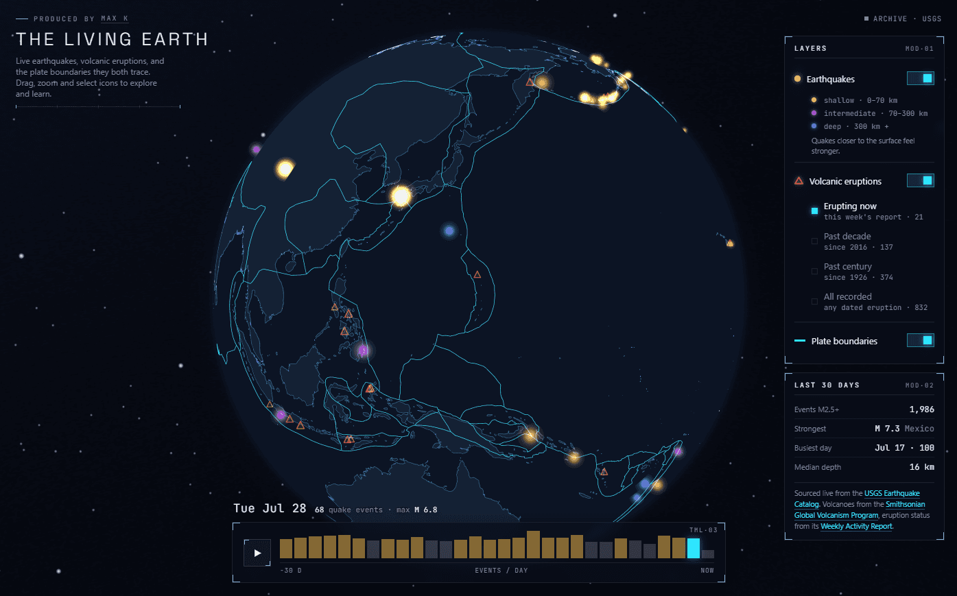
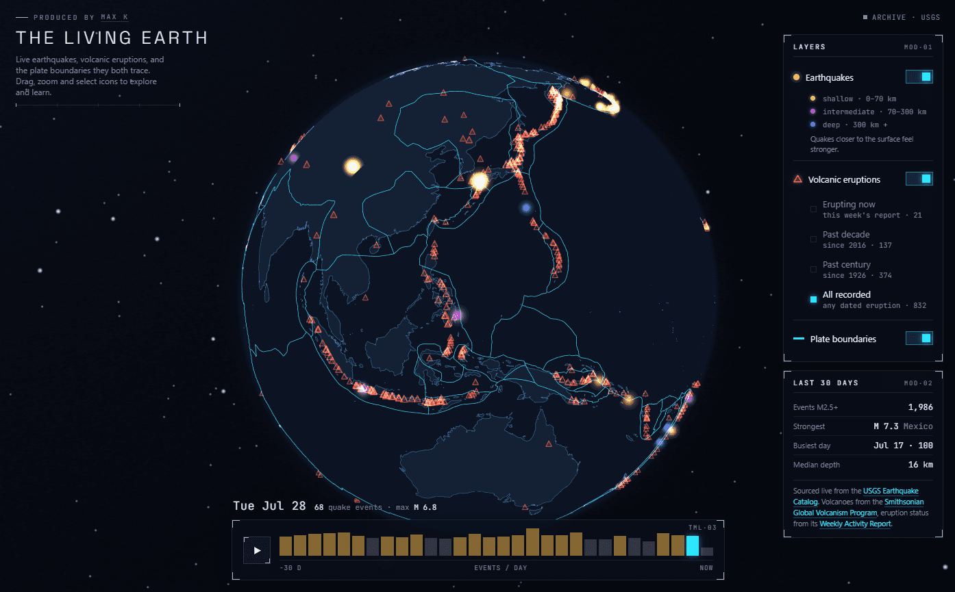
The Living Earth visualises real earthquakes and volcanic eruptions as they happen, using publicly available APIs to create a living system.
Quakes bloom and pulse like sonar the moment they hit. Volcanoes sit along the plate lines as glowing triangles.
Scrub through the 30-day timeline and watch the Ring of Fire draw itself, or view a map of every volcano that is erupting right now
Screenshots


The Takeaway
What I learned…
Designing with real data
Plugging live data in early meant designing around the actual shape and density of events, giving me a much clear picture of the final product at an earlier stage. Something that will definitely come in handy for my day-to-day design work.
AI prototyping
Building a working interactive mockup in HTML let me test scrub, drag and playback behaviour for real before writing a single spec.
Locked decisions as documentation
Keeping a running record of what was decided and what was rejected stopped good directions being reopened and kept the visual system consistent.
Encoding by shape, not colour
Earthquakes and volcanoes needed to read as different kinds of thing, so type is carried by mark shape rather than another hue on an already busy colour palette.
Designing the seams before the features
Scoping a generic layer interface up front meant volcanoes, timelines and future datasets slot in as configuration instead of triggering a complete redesign.
AI accessibility
Using AI to pressure-test keyboard operation, reduced-motion behaviour and focus states caught gaps that are easy to miss on a canvas-heavy interface.
The outcome
Overall it was a strong learning experience building something outside of my usual area of work with new tools to match. The end result is unique learning tool that reminds me of the Restless Surface exhibition at the Natural history Museum, that I used to love as a kid.
I now feel much more comfortable building my own live data prototypes which should significantly improve the efficiency of my day-to-day
View the full site here